Happy Xmas. Coca-Cola billboard offers free gift wrapping paper while shopping

Here’s some new work from our agency. These specially crafted billboards are the ideal way for Coca-Cola to help you celebrate Christmas.

“As the brand that stands for “Open Happiness”, Coca-Cola believes there’s no better time to open happiness than with Christmas. But to open happiness… you need to wrap it first. That’s why we created a billboard made entirely of wrapping paper, allowing people passing by to tear off a piece of paper to wrap their presents.  The iconic line “open happiness” is printed on this specially crafted wrapping paper, because nothing says it more like a present waiting to be opened.”

Enjoy!

TED2013: A trip worth remembering!

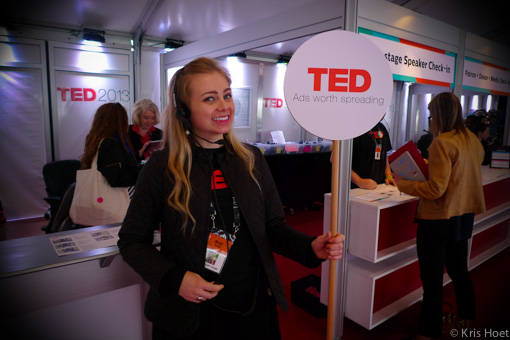
The last week was pretty amazing. Thanks to TED’s 10 Ads Worth Spreading initiative I spent a few days at TED2013 in Long Beach combined with a day at TEDActive2013 in Palm Springs together with 9 other selected agency folks as well as a few people from TED and Google who are partners in the program. The reason that I got there to begin with was the fact that our agency’s ad ‘Push to add drama’ for TNT was selected as one of those 10 ads. Which is already pretty amazing on it’s own.

TED2013-1

The one thing (to begin with) you have to do after reading this post is to go check out all 10 ads. Some you’ve probably all seen and shared already such as BBH’s ‘3 Little pigs’ for The Guardian, ‘Dumb ways to die’ from McCann or Y&R’s ‘Security Cams’ for Coca-Cola but others will probably new to you as they were to me. ‘Follow the frog’ for instance, from Max Joseph or  Make sure you check them all out, great stuff in there. Pretty cool bunch too.

So there we were. Invited by TED, ready to be inspired and with a packed agenda for 2 days at TED in Long Beach and 1 day at TEDActive in Palm Springs. Both these conferences run simultaneously and show the same content (via simulcast from Long Beach to Palm Springs). In Long Beach where the ‘real’ TED is you will find yourself amongst business leaders, CEO’s, former TED speakers, movie stars, … who are all looking forward to some great talks but also great encounters during the breaks. People will all just walk up to each other, introduce themselves to each other and start talking about what they’ve seen. And how we all know TED as a very exclusive event, the vibe at the event is pretty down to earth which was counter to what I expected it to be.

TED2013-3

TED2013-2

At TEDActive the crowd is much younger, I was under the impression that it was also much more international and it felt a lot more creative as well. And what struck me was that even though all talks were via simulcast on TV screens everybody would go inside and watch every single minute of it. During the sessions you would find pretty much no-one outside just chilling in the sun. Imagine that at Cannes Lions for instance – the idea alone sounds to crazy to be serious about it. Very interested crowd, very disciplined and very inspiring.

TED2013-4

It’s too difficult to say which encounter was the best (although the close encounter with Cameron Diaz is worth bragging about ;-)) or which talk was the most interesting to watch. You have to imagine yourself sitting in between the co-founder of Groupon on the one hand side and Blaise Aguera y Arcas (2 time awesome TED speaker himself) listening to Taylor Wilson, an 18 year old that built his own nuclear fusion reactor at 14! How awesome is that?! Not to forget all the conversations with my fellow ad men about their advertising, how they got to sell it to their clients and what they think made it unique. I’m sure other sites will give a wrap up of the most powerful talks, I will probably highlight a few of them later on this blog as well.

I want to repeat myself and applaud all the awesome boys and girls at Duval Guillaume Modem for making such great work. It makes me want to go back to the office and try to make even better work so we can get back in that list from TED so one of my colleagues can experience this for him or herself. Thanks for that. This week was awesome!

TED2013-6

And special thanks to Shanna from TED for the awesome organization!

A lesson from Steve Jobs

tumblr_lbcdroLUYE1qz6pqio1_500

I just finished reading Steve Jobs’ biography. It took me a while to read it but I’m happy I bought it. I wasn’t all that sure in advance, and not because I used to work at Microsoft once, but because I just didn’t want to read a book about how great everything at Apple really is thanks to the genius etc etc.

It’s not at all like that. The book manages to give a very real – at least it feels that way – image of Steve Jobs and very human, much more human than how your regular fanboy will be talking about him. And that made it interesting. You get a better idea of how he really was, about the things that made him great, about the people that have been his mentor, about how he often wasn’t really such a nice person, about the genius, …

I made quite a few notes while reading the book, notes about things and ideas that I recognized or that I should look into a bit more. One of those things was the Apple Marketing Philosophy that was written down by Mike Markkula. Short but crystal clear.

  1. Empathy – that intimate connection with the feelings of the consumer to truly understand their needs better than any other company
  2. Focus – eliminate all of the unimportant opportunities in order to do the best job possible
  3. Impute – a company should convey its values in everything it does, from packaging to marketing because ‘people do judge a book by its cover’

You should read the book. Seriously. Not because you want to find out what an epic genius Steve was or anything like that – but because just like Steve you should steal from the best, see things with new eyes, work hard to make them different and don’t stop until they’re perfect. Respect.

My next book? Indeed – Steal like an artist, by Austin Kleon.

Presentation madness

Powerpoint, Keynote, … it doesn’t really matter much which piece of software you use to make a presentation. Trust me, there’s only little the software can do for you to make your presentation better, let alone good.

I get my fair share of practice making presentations since I make a few per week, but I also get to see a lot of presentations at events, with clients, suppliers, etc. The list below is an overview of my rules of thumb for creating good presentations.

The audience

First things first. Who are you talking to? It’s probably what bothers me most at conferences, all too often you see a presentation that is not at all tailored for the event. It’s more about what the presenter wants to say versus what the audience came down to hear.

But this doesn’t only count for conferences of course. Also when you’re presenting to your team, your boss or client(s), whatever the situation may be, the audience is key for what and how you will present. What is it that the listener wants to see? What do they expect? What is the context of this presentation? Trying to understand that is like a third of the success of your presentation.

The purpose

What is the reason for the presentation? What’s the goal? What was the briefing or what are you trying to get out of this? New business, an extra headcount, an extra effort from the team, understanding for a difficult decision, buy-in on a company vision, … How many times do you listen to or read a presentation and wonder: what’s the point? The presentation looked nice and all but don’t ask me what it was about.

What’s the point that your are trying to make? I think it’s important that you define the key take-aways well in advance. They don’t have to be crystalized (there’s room for that later in the process) but you need to have a good idea of what it is you want people to remember after the presentation. What it is you want to send them home with.

What is basically the end of the presentation is something you need to define at the start of making it. It’s where you need to build up to and it’s your first check on whether the presentation is in line with purpose you’re making it.

If you want me to do something, you better make that clear so I know what it is that you are looking for.

What do you need to get there?

So you know what your audience came down to see and you defined what it is that you want them to home with. Next step is to think of all the elements you need to have as key ingredients for your presentation.

Think of it as tearing out magazine photo’s before you can start making a collage. You have an idea of the end result and gather photo’s that you think will help you build a story to get there. With presentations it’s the same. Think of all the things that could be helpful to make your point. Quotes, articles, schemes, graphics, ideas, … and lay them all in front of you so you can see which ones you think you could use most.

Turning it into a story

Start with setting the scene. All too often I see a presentation that jumps right into a topic and only by the 3rd slide you figure out what the presenter is actually talking about.

“Bad storytelling is beginning, muddle, end.” (Philip Larkin – poet)

This is probably the most important part of your presentation. You know where you want to land with this, but how do you build up to that point? How do you make it so that within the timeframe that you got, you bring your story/presentation in the most powerful way? Will you start with laying down the problem? Or with the conclusion? There are many ways in building a great story and it’s up to you to figure that one out, but make sure you spend enough time on it. Make sure that you cut out all that is not necessary to make your story come to life.

Using post-it notes to lay out a grid of ideas in front of you and order them is a common trick but a really good one, and one that I also use when building more complex presentations.

Design

I love a nicely designed presentation just as much as everyone else. I don’t think it’s key to a good presentation though, it sort of adds an extra quality to it. Too many people seem to think design is amongst the first things to get right – that’s really not how it’s supposed to be. Some of the best presentations I’ve seen at conferences were of the worst design you can imagine… including Comic Sans.

Make sure the fonts are correct, the typo is the same throughout the presentation, the photo’s are aligned, … these are all easy to do and make the presentation from not looking sloppy. A great design doesn’t make it a better story, so make sure this is not where your main focus is. Or let me say it like this – a presentation full of quotes on a photographic background per slide is not a good presentation, just saying.

Check it

It’s ready so give it a swing. Go over it, maybe with a colleague or someone close to the topic, and see what you (and they) think about it. Did they see the point you were trying to make? Was it clear how you tried to build up to that? Did you feel comfortable with the story? Isn’t there anything missing or isn’t there too much you’re trying to say? The stage is a terrible place to figure out whether you made a good presentation or not, so make sure you got that checked before.

Another check that you need to perform is timing. I hate it when people don’t respect their timing, it’s a simple thing but a form of respect that you don’t abuse the slot that you were given for your presentation. Often people give presentations that aren’t specifically tailored to an audience nor a certain time slot and you can tell from the very first minute that that is the case. Don’t do it. If you want your story to come over right, you need to manage it within the time that you got. It’s different for everyone but I mostly count around 1.5 to 2 minutes per slide, which gives 15 to 20 slides max for a 30 minutes presentation (without title or exit slide)

Bonus check

Sometimes the organizer asks the audience to give feedback on the conference and when they do make sure you get the feedback on your presentation. You might learn something from it. And in case it’s a public event, check out Twitter after your talk as well. And don’t just look for kind words, but for what people tweeted about the presentation, see if are the key elements of the presentation, see if it are those things you wanted people to remember (and share).

Good luck.

A network of networks

Fascinating. And visually attractive. The people of LinkedIn Labs just recently created this InMaps application, a kind of analytics tool to “visualize your professional network, clustered in realtime based on their inter-relationships”. A pretty cool tool actually, and I’m a sucker for these kind of applications.

Log in with LinkedIn and the tool will analyze your network and visualize it in a graph like the one below, which is actually the output of my LinkedIn network.

What’s extra interesting about it is that the output is dynamic (unlike this image) and that you can hover over each contact to see their specific connections within your network. That way you also get a view of how the clusters are made and InMaps allows you to put a label on each colored cluster to make it easier to see who’s who. Just give it a try, you’ll see for yourself.

Interesting results for myself is to see for instance that I have 2 Microsoft clusters (I’m ex-Microsoft remember), one for MSN/Windows Live related contacts and one for more general Microsoft contacts. Interesting to see that this split is made, although it’s actually pretty logical when you look at it. Also interesting is to see between which groups exist more links, not always what you would expect. I’m definitely not done analyzing this, but curious what your graph/learnings look like so please do share ;)

Last but not least, it’s also pretty interesting proof that people are organized in groups, clusters and that if you want to influence people it’s important you understand these clusters – or ‘spheres of influence’ like we used to call them, dixit David Armano.

Rethinking the mobile web

When we think about mobile today, we think about the iPhone. And if you’re lucky we think about Android as well. But as this presentations shows (once more) that is only a small percentage of the mobile market. Wouldn’t we want all (or at least most) mobile users to be able to experience ‘our offering’.

This presentation is a good eye-opener on the question we should all ask ourselves? Shouldn’t we make the mobile web more inclusive? And how would we go about to do that?

I surf because…

It’s been a really long time since I surfed for the last time, too long really. I used to go windsurfing during the summer holidays when I was younger and always loved to be out there on the board. I might not have been great at it, but enjoyed it as much as the next guy.

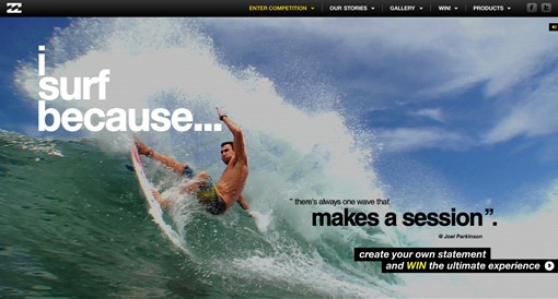
Part of why I like the ‘i surf because’ campaign from Billabong so much is that it seems to capture really well what surfing is all about. Nice visual experience, the right music and the question – why do you surf? And that’s exactly what Billabong is trying to capture with this website, the question is to you (surfers), why do you surf?

isurfbecause

Nice execution as well. Like.
Cowabunga!

Lucky Counter: more tweets, lower price

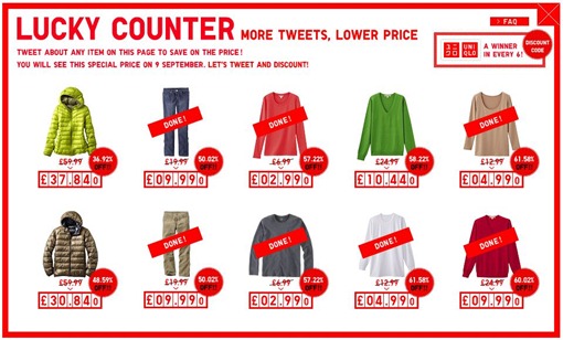
Uniqlo has a new campaign out there, pretty simple as well. Tweet about an item on the page and it will lower the price of that item. It’s a win-win. Really simple and a nice way to get free promotion for no risk at all for Uniqlo (there’s a minimum price anyway). End at the same time it’s not much to ask to a consumer either (it’s just a tweet) to to get an immediate benefit.

uniqlo1

uniqlo2

Like.

My issue with the iPad

It’s not about the lack of Flash support. Although you visit less sites in their mobile version (if available) on the iPad thus the lack of Flash support is a bigger pain than on the iPhone, I knew what I was getting into when I bought one. Nor is it the lack of multi-tasking capabilities, I’m sure once iOS4 arrives on the iPad we will have that (kinda) sorted out. And also the fact that there are only few really good iPad apps is an issue (for now). There may as well be several thousand apps available (250.000 if you count all iPhone apps), we all know most of them are rubbish.

My issue is with the OS. It still is a big phone, without the phone functionalities then… probably to avoid situations like this to happen. Now a mobile phone typically is a very personal piece of technology. You don’t just hand to someone else to toy with it, it’s yours and personal. And that’s where the problem lies, for me the iPad isn’t personal. Not like the iPhone (or any other mobile phone for that matter). My wife and I both have our own mobiles but it’s rather unlikely that I we will get a second iPad, we both use it. But since it’s built on a mobile OS, it’s not really built for multiple users. There’s no need for that on a phone but it means that on the iPad there’s a primary user next to other people that can also use it. But not in the same way.

Still don’t see the problem? I really enjoy Flipboard, so does my wife. But it’s logged in with my Twitter/Facebook accounts so she cannot really enjoy that part. I could add her email account(s) to the iPad but then those would be visible to both of us, that’s not really what you want. And we try and beat each other on playing Mahjong but since there’s only one high score, it impossible to tell (remember) who it was from. It would enable me to personalize the iPad for the kids when they use it as well. With us, the iPad is typically lying around in the living room for anyone in the family to use when they feel like it. But since I’m the primary user (and the geek – yes, that too) it’s mainly setup towards my needs. I find that a missed opportunity.

It would be great to see the iOS for iPad change in a way you can have a user login upfront, similar to what we are used to on our PCs/Macs. Or the possibility to switch between users, all to get a more personal experience on a multi-user/shared device. I’m afraid that is not going to happen (soon) so maybe in that case it’s worth asking the developers of Flipboard, Reeder, Mahjong, … to implement the possibility to switch between users in the app itself. Less ideal, but it would still solve my issue with the iPad.